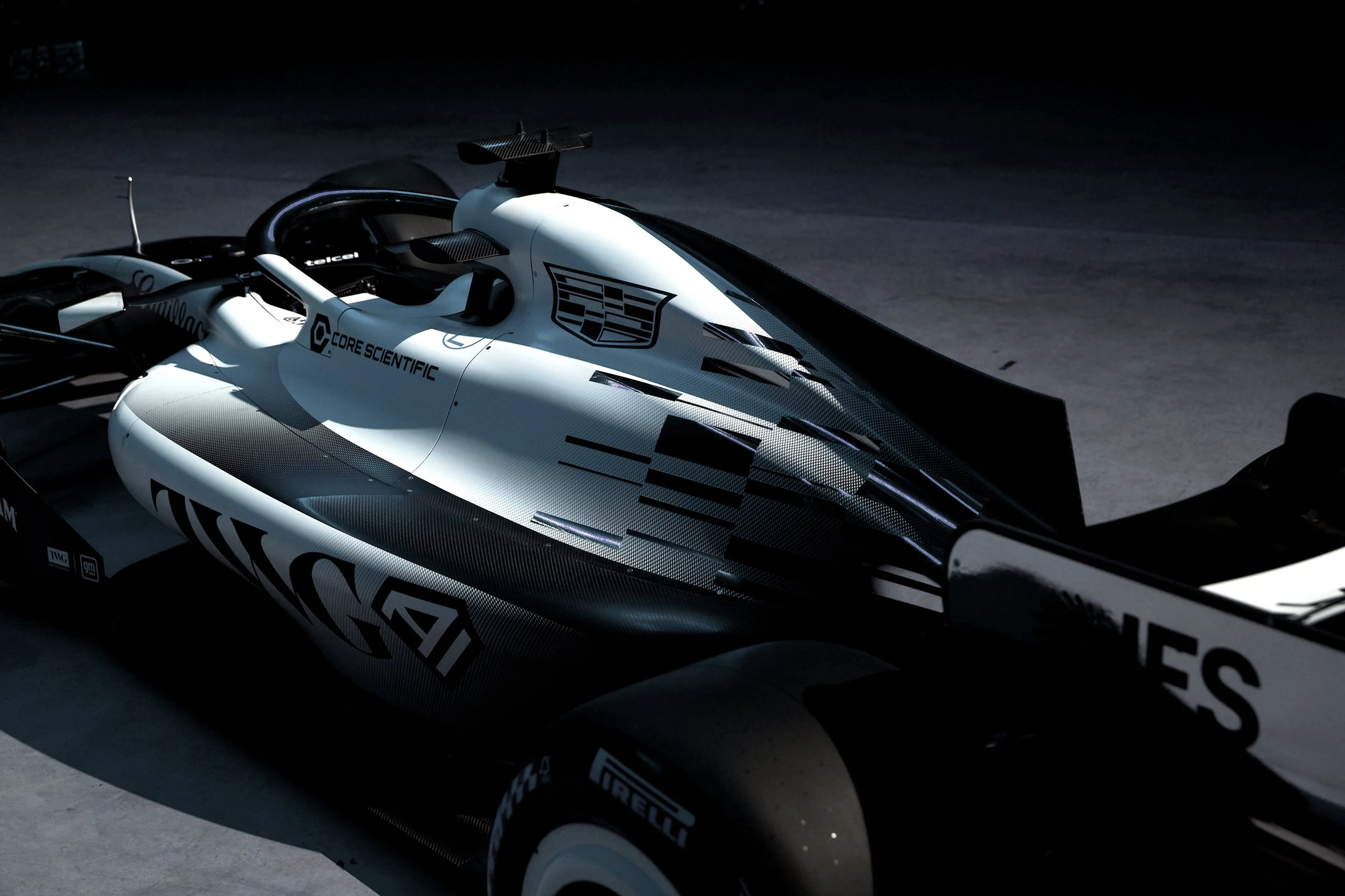
CF1 CAR
TEAM DESIGN LANGUAGE
The Development of the CF1T identity centred around the approach of evolving the existing Cadillac brand marks to define a race team that represented the pinnacle of performance, design, refinement and style. An identity worthy of a motorsport entity competing in the premium racing realm of Formula 1.
The brand language took three key brand identifiers as a foundation from which to develop the teams unique identity while respecting the Cadillac brand legacy.
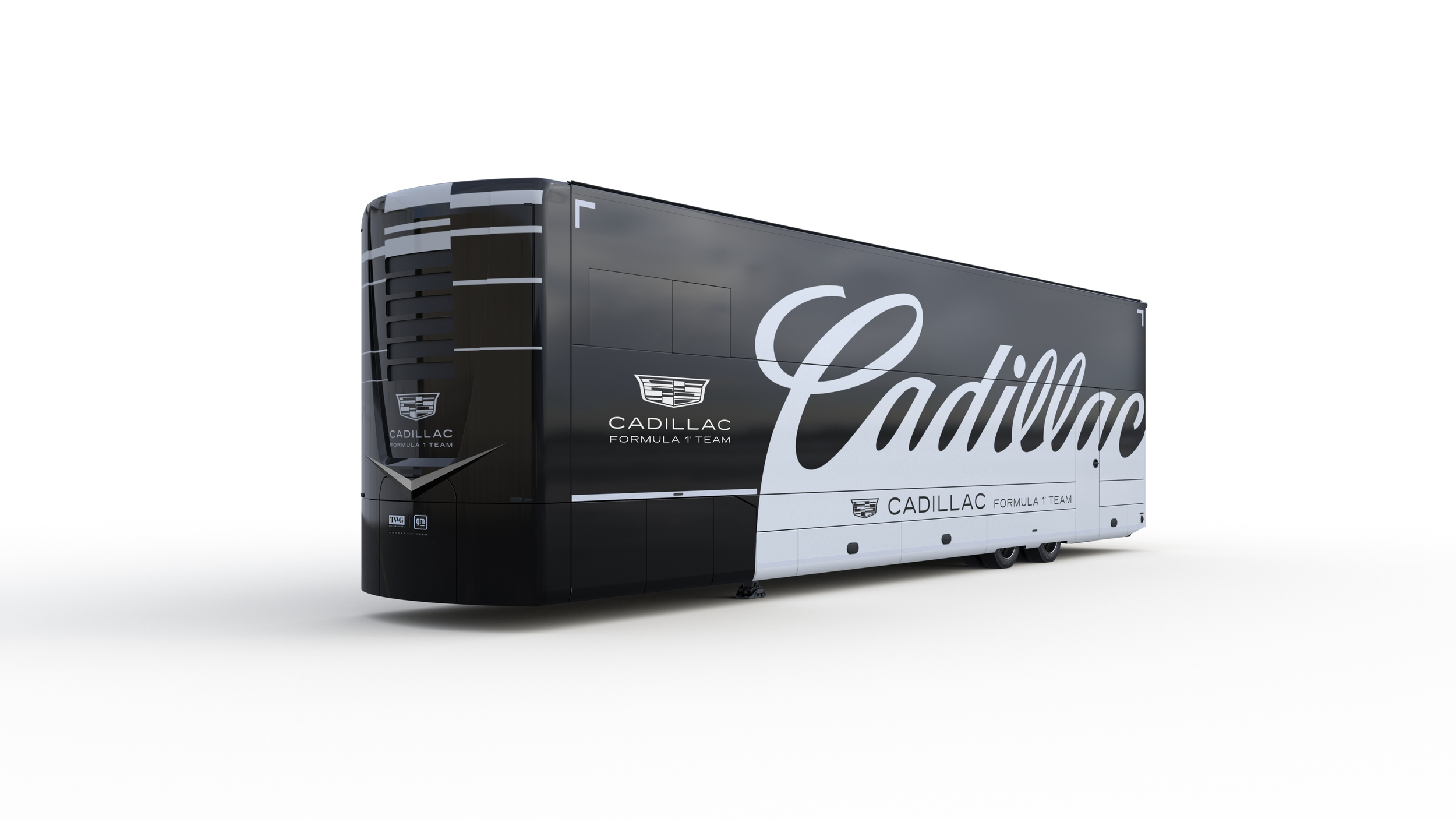
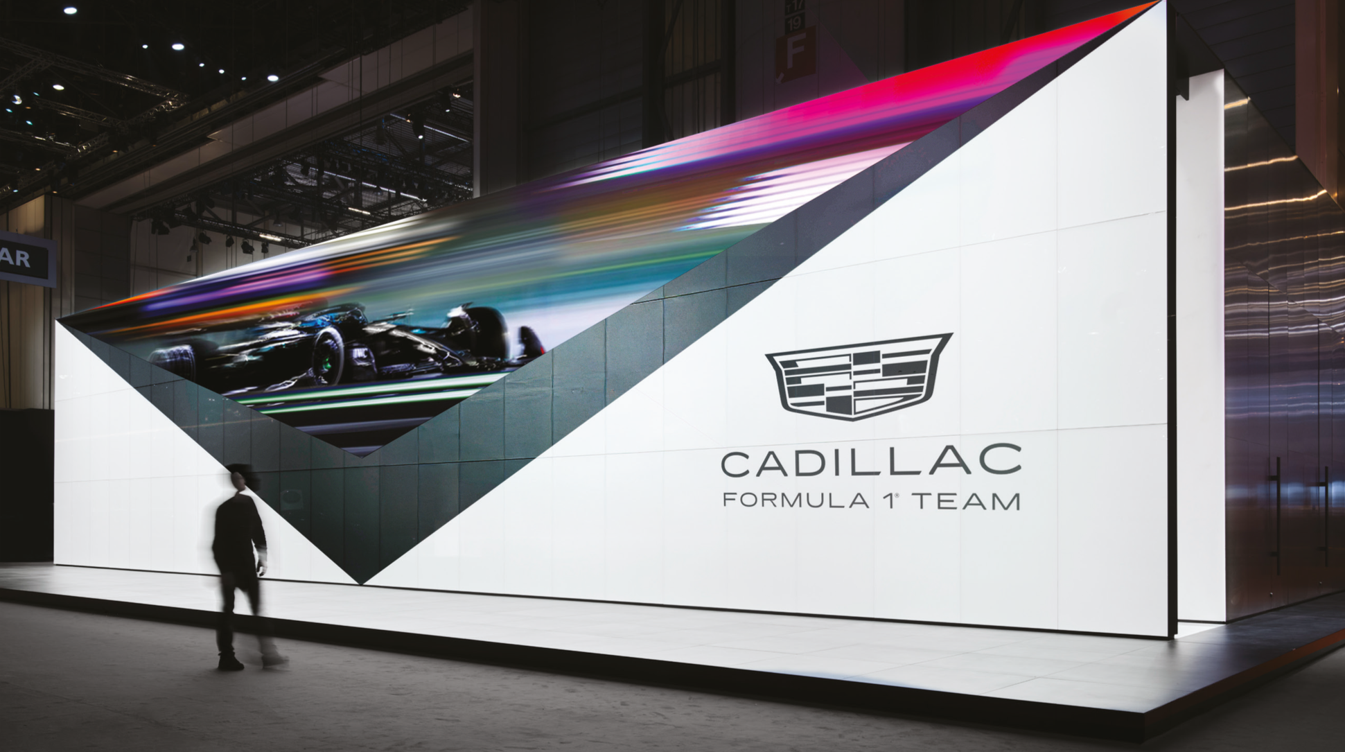
RACE SERVICE where tasked with the job of taking these brand elements to design the livery of the race cars that will grace the track for the 2026 season.
Mark one…
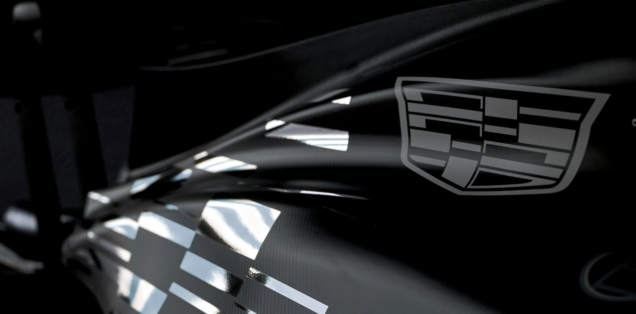
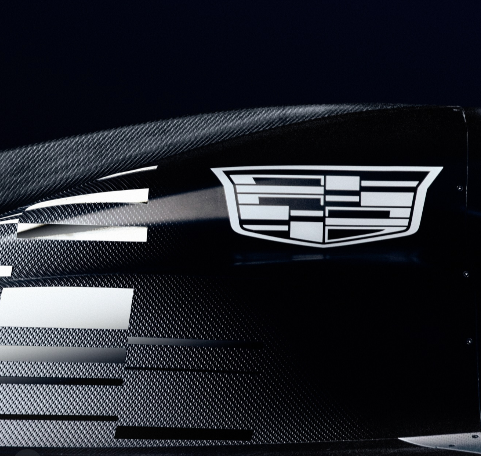
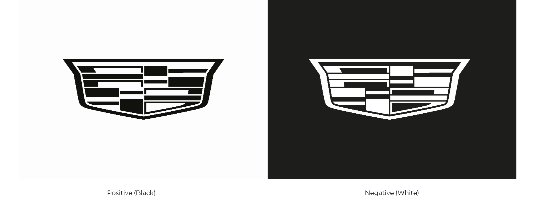
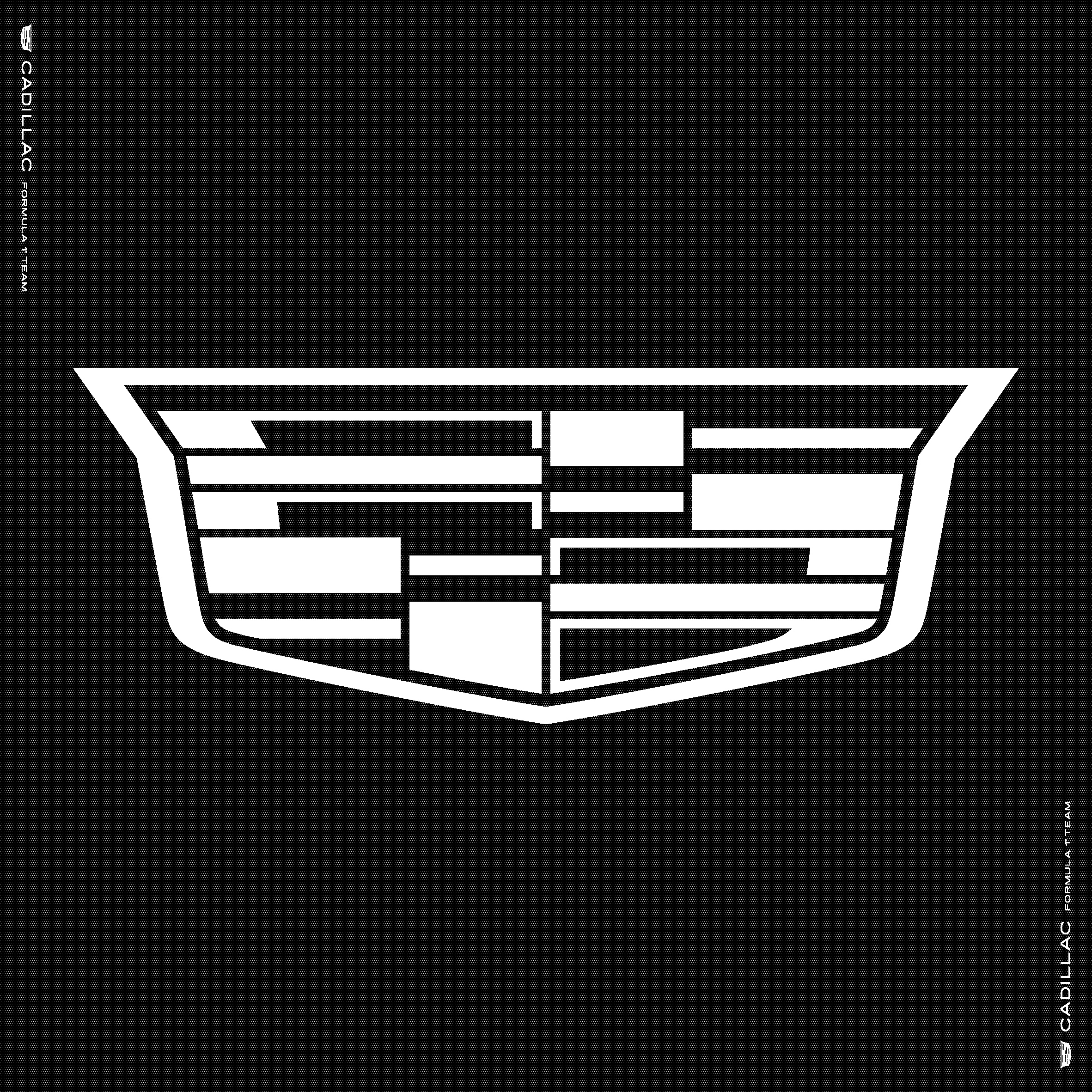
The Crest
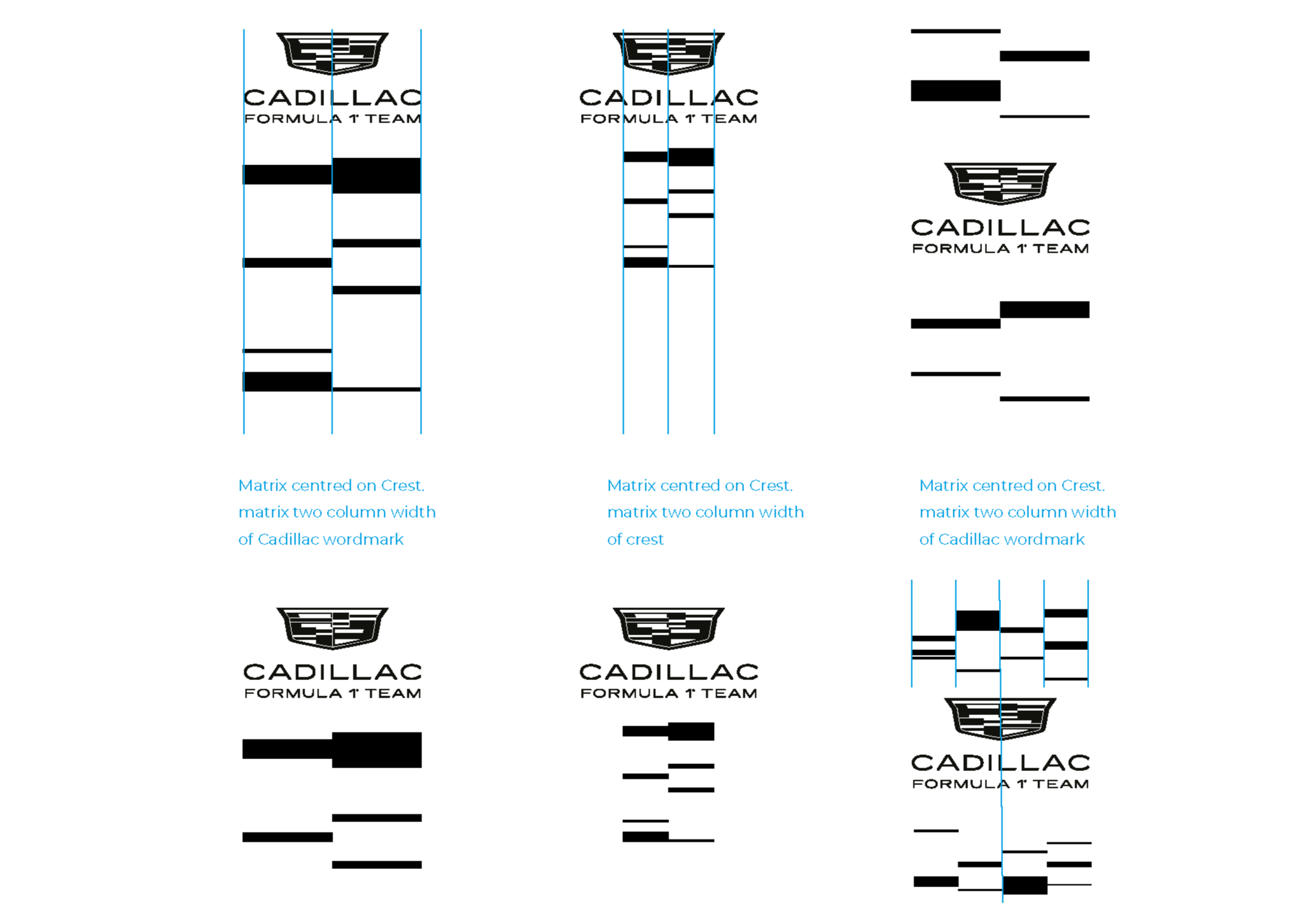
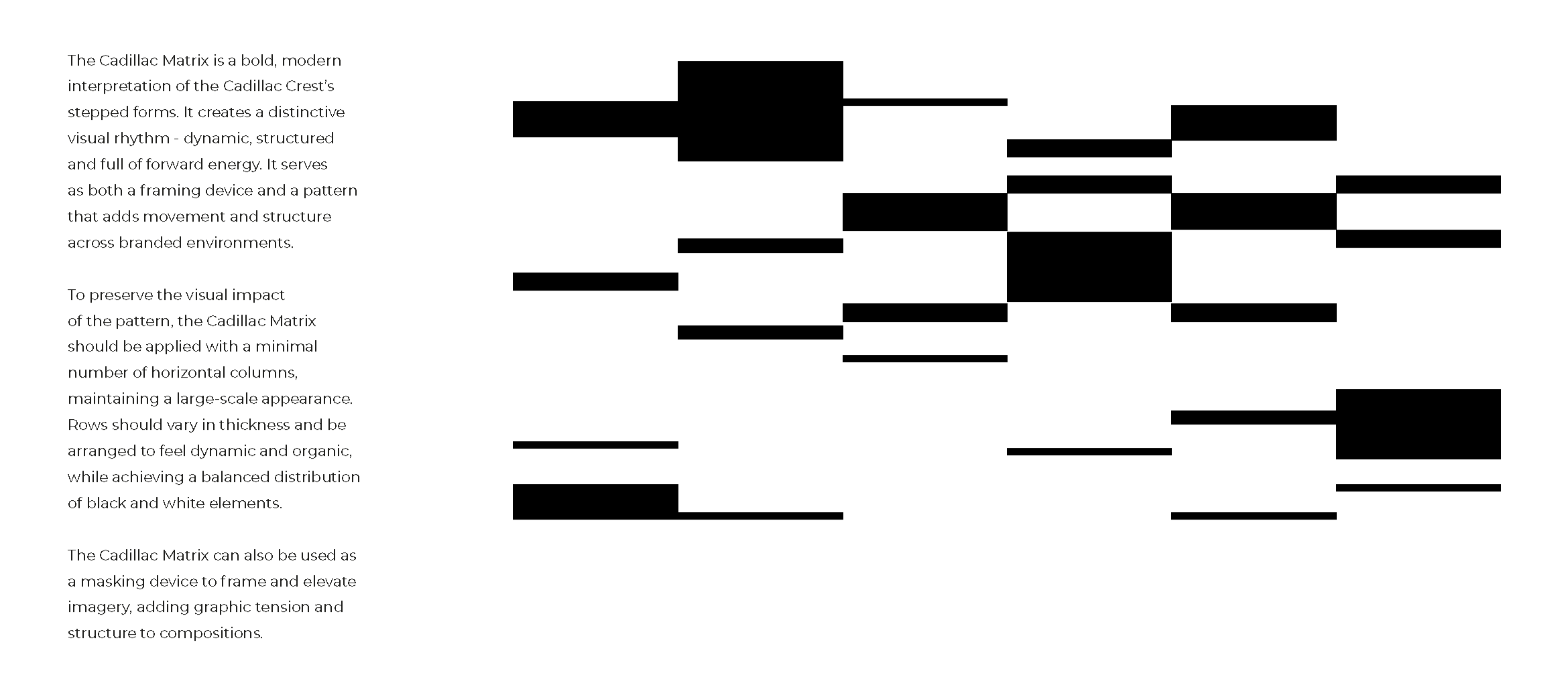
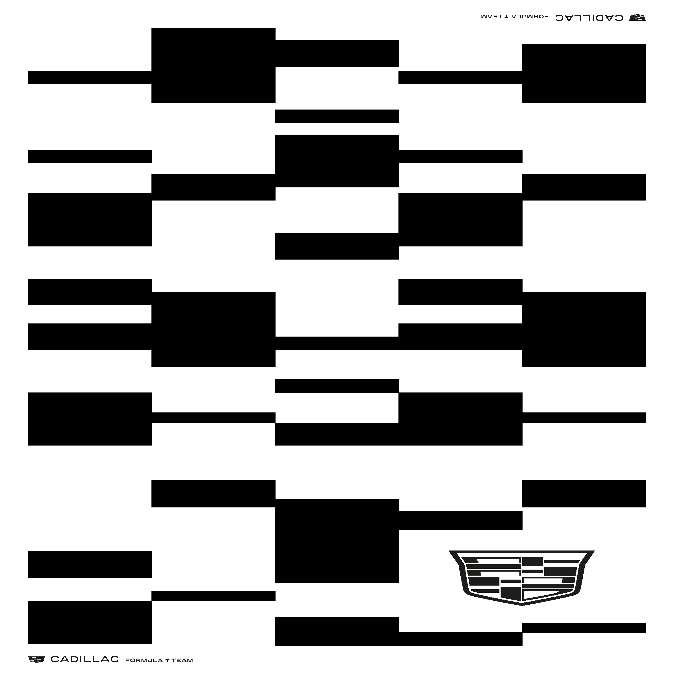
The Crest mark was modified and streamlined to be consistent when used on dark or light backdrops by removing the inner crest outline for a cleaner lightweight brand mark. From here we then developed a graphic language that reflected the block heraldic shape language of the crest.
This graphic pattern was modified to represent the evolving racing DNA of the Cadillac F1 team, referred to as the CADILLAC MATRIX.
Mark two…
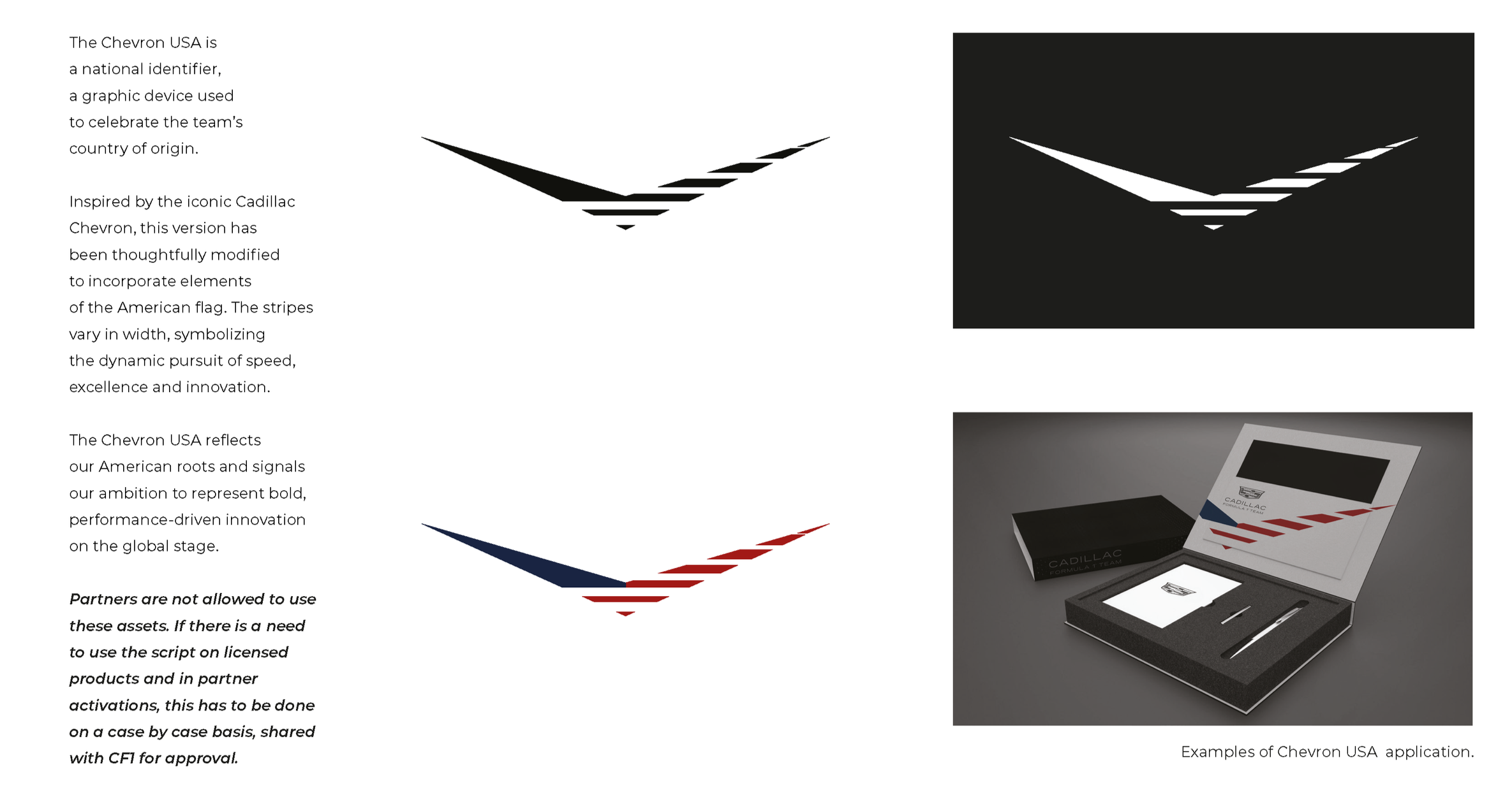
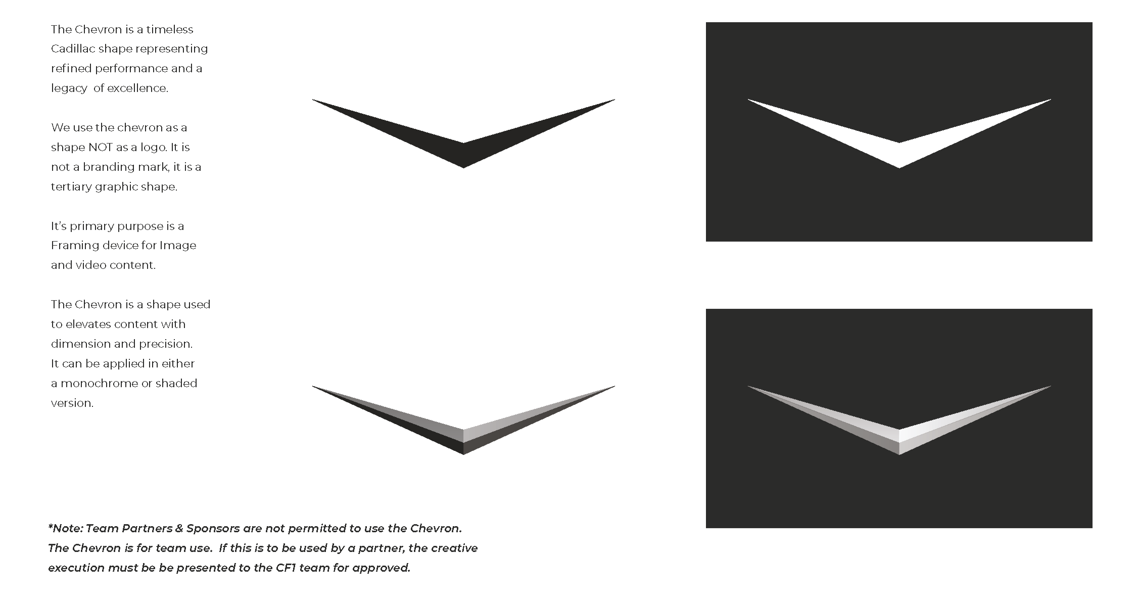
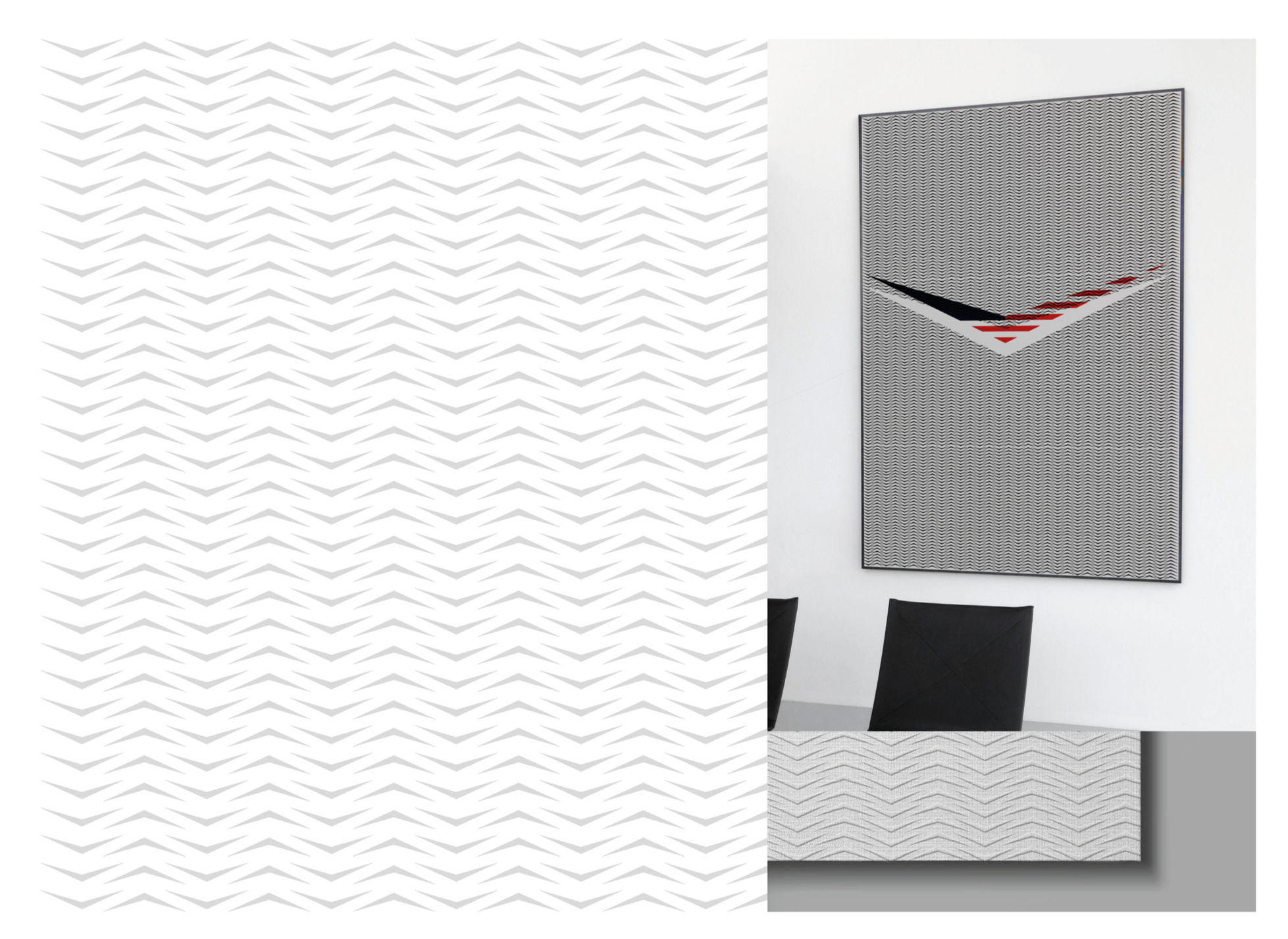
The Chevron
This mark has gone though many evolutions during the lifetime of the Cadillac brand. Once a primary mark its now exists as a legacy mark. This clean dynamic form still remains a dystinct symbol of the Cadillac brand. We utilsied the Chevron shape language as a device that frames the brand narratives, as well as an expression of the Teams American identity.
Mark three…
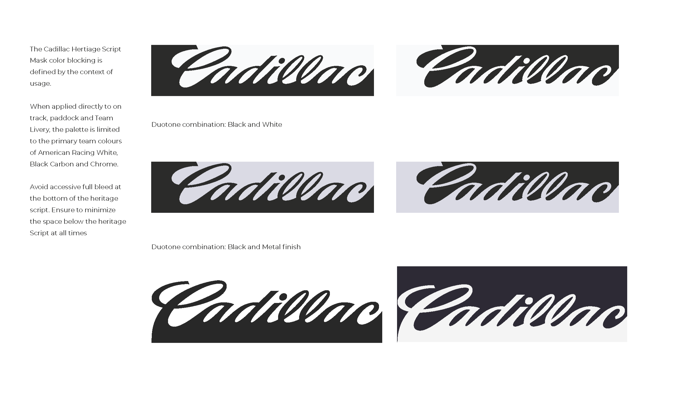
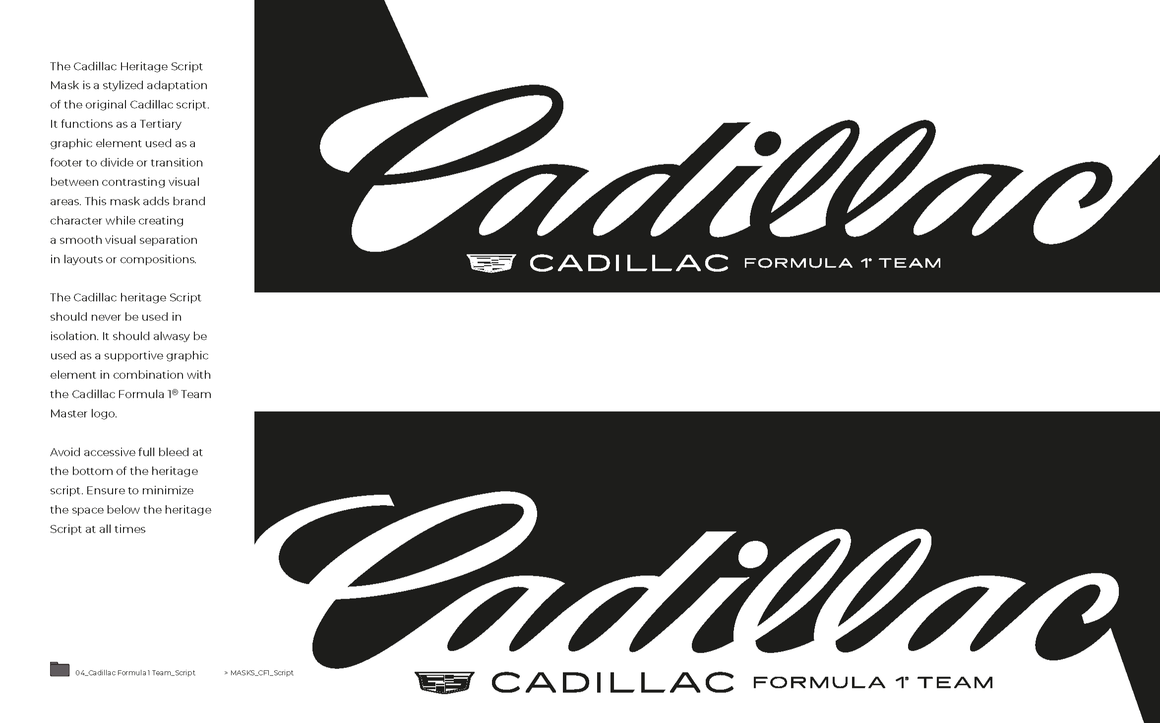
The Script
A legacy mark that expresses the Bold luxurious, nostalgia and Americana of the racing team. The mark was modified to integrate with the Teams brand marks and become an strong integrated branding elements when applied to various touch points.